10 tips to a better site experience
There’s nothing more frustrating than being on a website and having to search endlessly for information that should be front and center. Like when you’re trying to find a phone number for a restaurant and they only have a contact us form. Or when you can’t find the location of a conference you’d like to attend. Why isn’t the most important piece of information easily accessible? Maddening.
Coming up with a good website user experience (UX) doesn’t have to make you crazy. It just requires some planning, organizational thought, and sometimes just plain old common sense. Here are some tips for planning your website UX:
1) Determine the goal(s) of your site
Depending on the type of business you have, your goals will be different. If it’s just to have a presence, that might not be good enough. Here are some thought-starters:
Do you want to keep visitors up-to-date? Write a blog and make sure you have the means to collect email addresses.
Are you selling goods? Make sure it’s easy to shop and purchase your goods.
Do you offer a service that takes appointments or reservations? Connect an scheduler app or make your phone number prominent.
MyoTechnology prioritizes making an appointment by having the button in the navigation, so it appears on all pages. They also promote services within the main “hero” image on the home page.
MyoTechnology prioritizes making an appointment by having the button in the navigation, so it appears on all pages. They also promote services within the main “hero” image on the home page.
2) Identify your audience(s)
This may seem obvious, but for many sites, it’s not. Especially if your site serves more than one audience. Some websites may cater to partners and consumers. The messages will be very different for these audiences and shouldn’t necessarily be treated equally. You should focus on your primary audience, but ensure information for your secondary audience is available, maybe even in the footer of your site.
Netflix is clearly prioritizing their home page to prospects with their “Try 30 days free” call-to-action, but they don’t forget about their current customers who want to sign in, which is in the upper right corner.
Netflix is clearly prioritizing their home page to prospects with their “Try 30 days free” call-to-action, but they don’t forget about their current customers who want to sign in, which is in the upper right corner.
3) Define a site hierarchy
Once you’ve determined your site’s goals and the audience(s) it serves, you need to think about content structure and hierarchy.
The home page
The majority of your site’s visitors are landing on your home page. You have no context where they came from or what they’re trying to do, so the home page’s job is to get them to where they want to go; sort of like a hub.
The body of the home page might call out short descriptions of other categories or sections within your site. Programs or products you offer, highlighting a recent blog post which serves to give an update on what’s new, or a promotion you’re offering.
Site sections
If the home page is the hub, then the sections are the spokes of that wheel. If there is content that overlaps, ask if it should be part of that section or on its own.
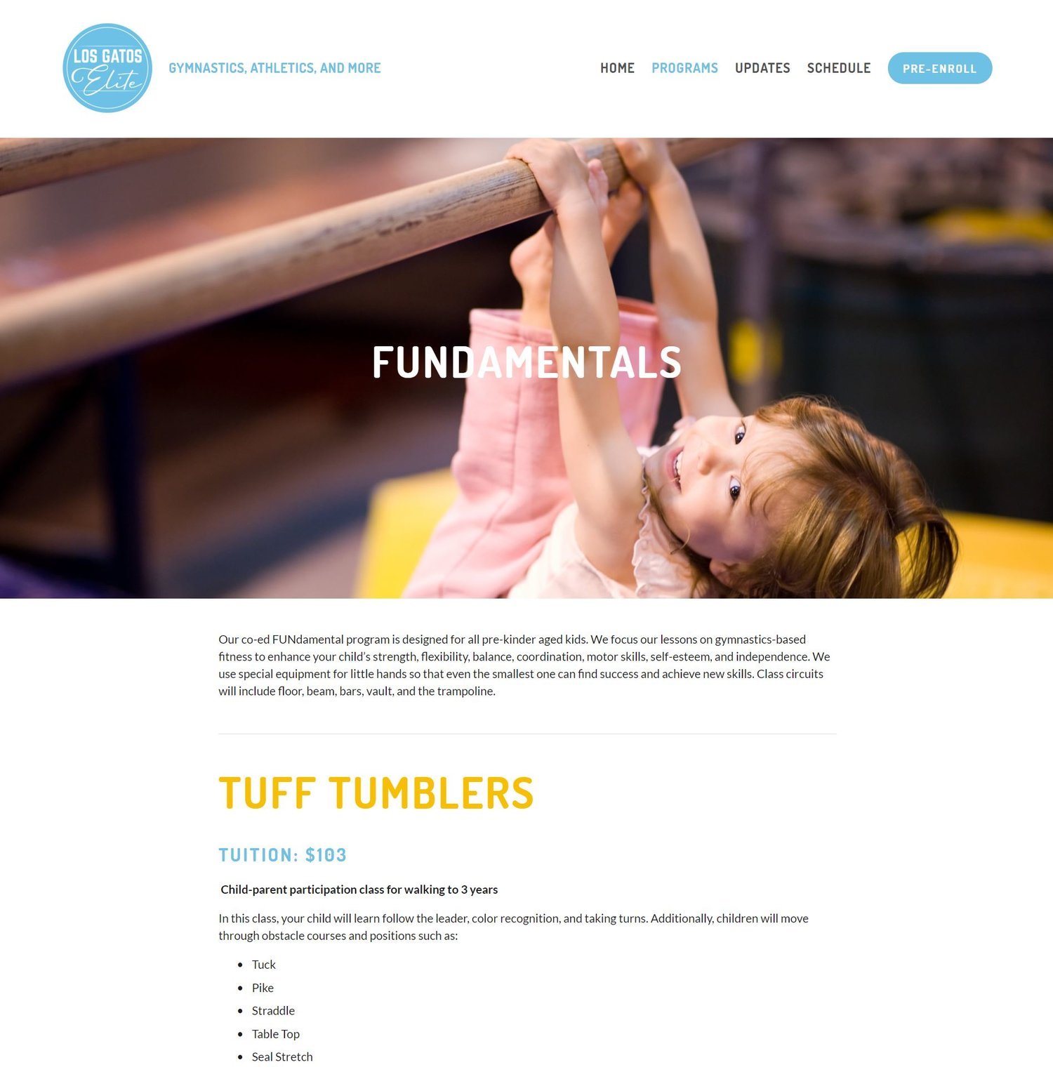
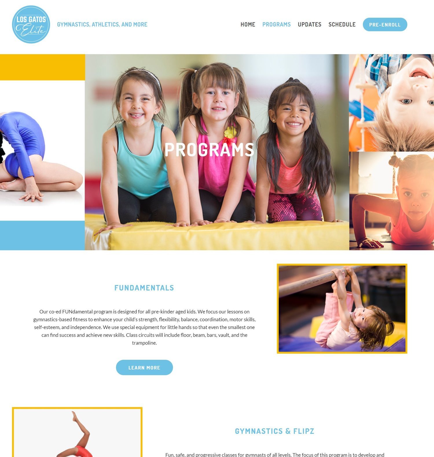
Los Gatos Elite tackled the hierarchy for the programs in the navigation with a drop-down menu that included each of the programs. A user could choose to go to the overview, which highlighted all the classes, or go directly to one of the programs. Within each program, they offered additional classes, so they created program detail pages to serve those classes.
Navigation
The navigation, which appears across all pages, is a shortcut to other sections of your site. The navigation doesn’t always provide context, so ensure labels are clear for the visitor. If you have a product name that nobody has heard of, perhaps that’s not the best label for a navigation item.
4) Take a customer-centric approach to a path
You can’t possibly determine what every visitor’s purpose is for visiting your site, but you can have logical next steps. If your home page is the hub, think about the next level of information you would like to expose. Ensure progressive disclosure to lead the user down a path.
What are the categories of information your customers or prospects might be looking for? Get yourself out of the mindset of “I want a blog” or “I want a gallery.” A good exercise is look at what you offer and determine the best way to showcase what you offer in the eyes of your prospect or customer.
5) Utilize your footer for secondary information
The footer is often overlooked, but it’s very useful. Contact information, who you are, a secondary audience (like employee portal or job opportunities), your privacy policy, can all be promoted in your footer. Users who are looking for that information will find it.
6) Use overlays, announcement bars, or pop-ups judiciously
Announcement bars and pop-ups have their place, but use them sparingly. These tools can help grab the visitor’s attention at the right moment and then can be dismissed.
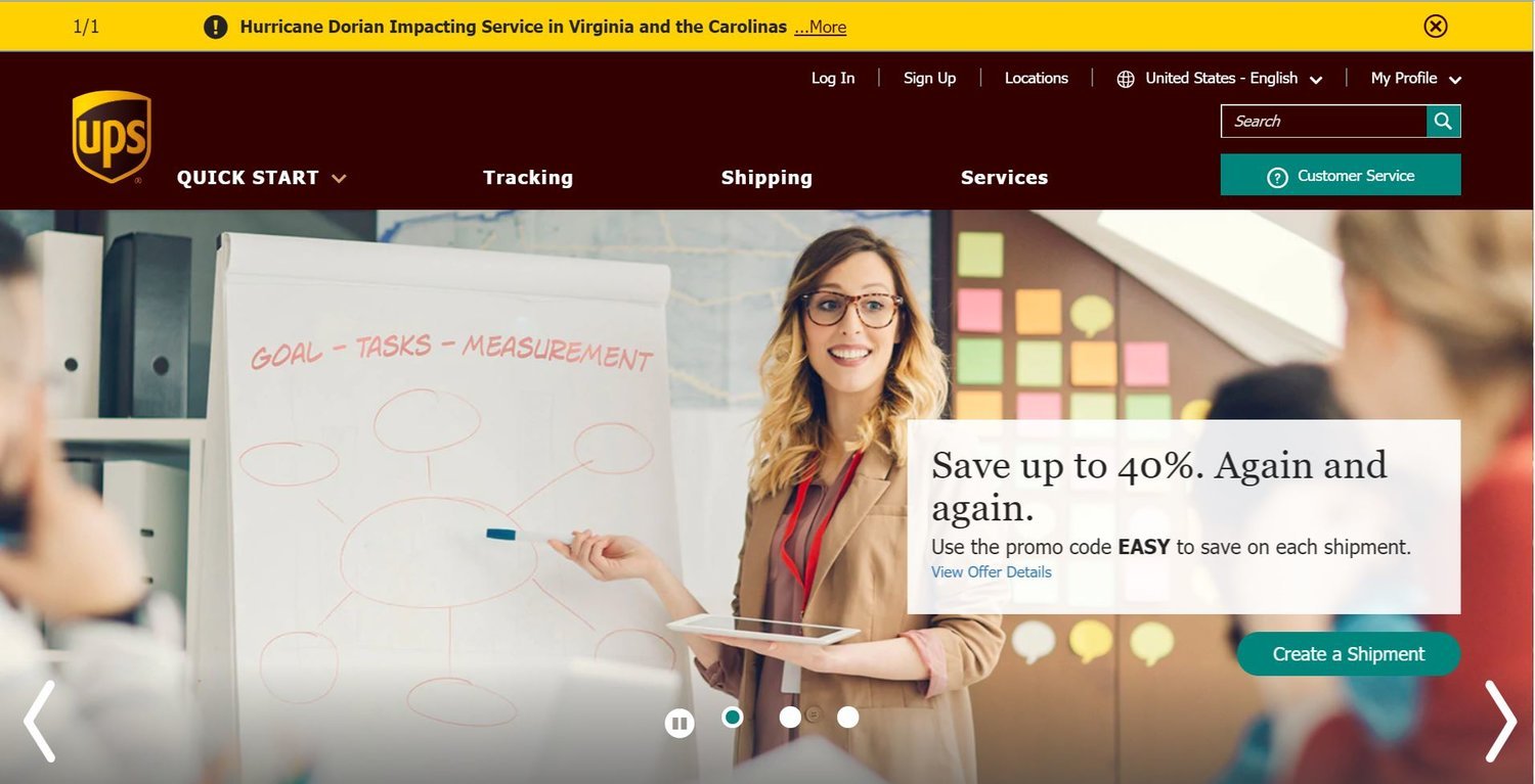
UPS made use of an announcement bar to inform site visitors that a storm may be impacting shipments. The design is bright enough to draw attention, but thin enough not to take over the site. It also is easily dismissed.
Nike has made use of a pop-up to collect an email address. This pop-up shows up about 30 seconds after being on the home page.
Ruelala, on the other hand, displays a pop-up and won’t let you enter until you sign in or sign up (or so it seems). Often these pop-ups can be dismissed, but visitors often fill it out assuming it’s a gated (locked) site.
7) Focus on legibility
Put your biases aside and ask yourself if your pattern of cats as a background helps or hinders legibility of your content. Chances are, it’s hindering, so put aside your likes and have contrast so your visitors aren’t distracted.
8) Ensure your site is mobile-friendly
The shift to mobile viewing has steadily been outpacing desktop or laptop viewing the past few years. Your website needs to be mobile-friendly or better yet—utilize responsive design. Platforms like Squarespace, Wix, and Weebly offer built-in responsive design so you don’t have to worry about it.
9) Keep content fresh
If you’re not spending money on advertising, the majority of your site’s traffic is going to come organically through search engines. A constant stream of updated content will signal search engines to drive more traffic to your site. While it takes effort to produce content, it’s a much more cost-effective way to drive traffic to your site.
10) Transparently track site behaviors
If you don’t have a tracking code on your site, you won’t be able to understand behaviors and get feedback on your site. That said, some countries require you explicitly notify visitors that you are tracking their behavior anonymously and by accepting the notice, they give consent. The notice does need to be conspicuous and it’s a good practice to start using right away. You also need to have methods in place to store the data and purge if necessary. If you’re using a third party like Adobe or Google, they have practices in place to purge data if necessary.
Assess yourself
How do you think your site matches up? Take theWeb User Experience Assessment orsend us your website URL and we’ll provide recommendations for user experience improvements if needed. If you’re looking to redesign your site,schedule a consultation.


